By Diane Harris, HQ Stitch Brand Ambassador
During the last few weeks of 2019, I took inventory of the unfinished projects in my studio. UFOs (as they’re called in quilt world) don’t bother me or cause me guilt, but seeing them all together did motivate me to reimagine them and do some serious finishing in 2020.
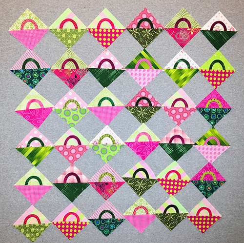
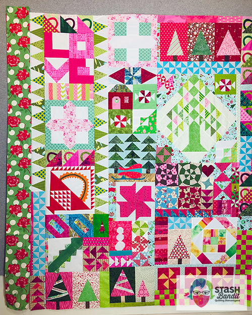
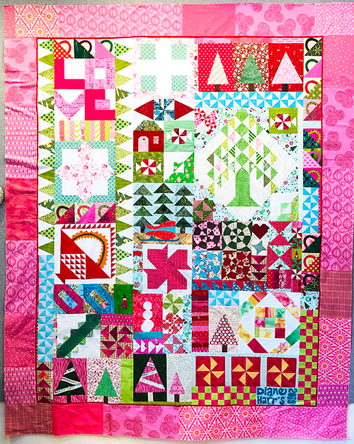
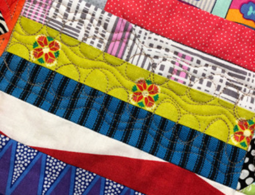
I had a bunch of these basket blocks left over and since Christmas was near, I pulled out orphan blocks, parts and pieces in similar colors. I must like this recipe because there was no shortage.
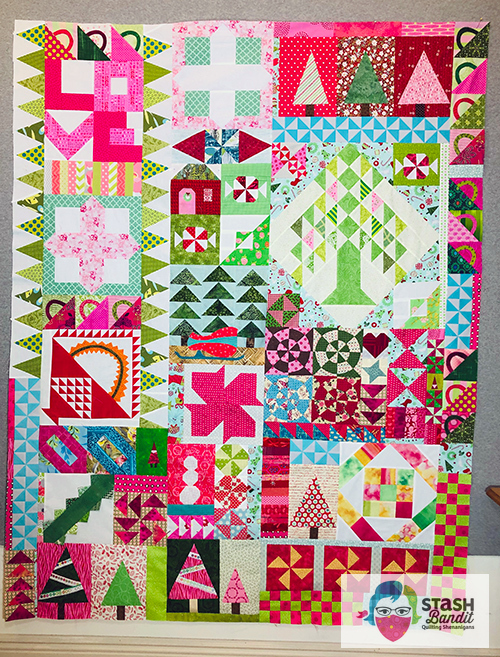
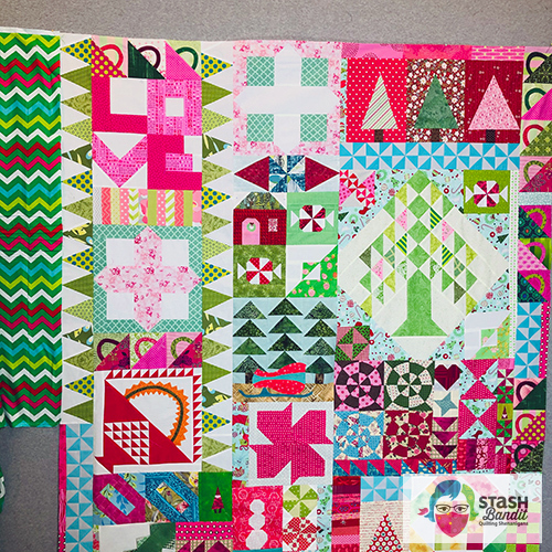
This is where I landed. I call this an improvisational quilt sampler because you make it up as you go along. Today I want to tell you about the process for choosing a border. It seemed to need a calm place for the eye to rest, so I set about auditioning border fabrics on the design wall.
First I tried red. This is a cute fabric with Christmas bulbs and its whimsicality fits the quilt. But the red seemed too harsh or too strong—too red.
I thought this plaid might work, but diagonal lines add movement, and the quilt didn’t seem to need more of that. The plaid also has a creamy tan cast and it felt too aged for the brights in the quilt center.
I thought these big Christmas roses might work. I still like them a lot but I don’t have a lot of the fabric and I have other plans for it, so I kept looking.
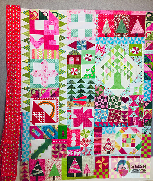
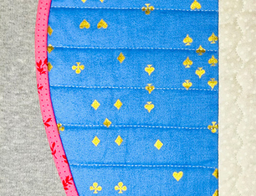
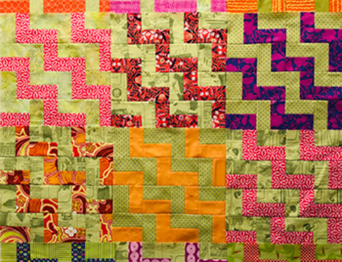
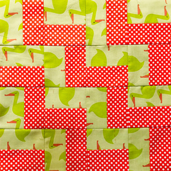
These chevrons have all the right colors and I like them a lot during auditions as seen here. So I begin to prepare enough wide border for the entire quilt.
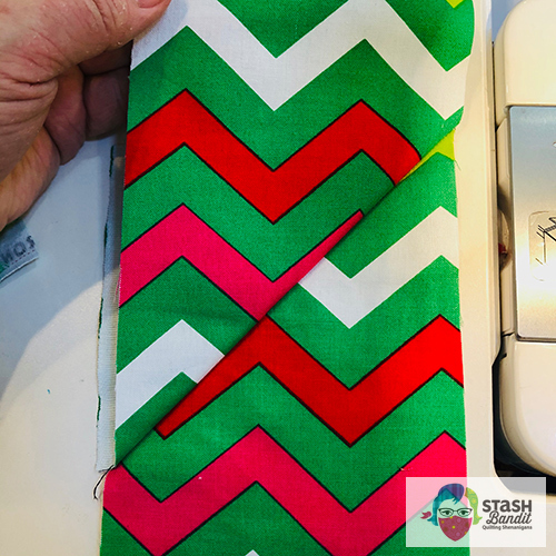
When I made the first diagonal seam to join the strips end to end, I realized there would be a problem. This looks awful and it will be an unsightly distraction. Instead of diagonal seams, I join the strips with straight seams and things behave a little better.
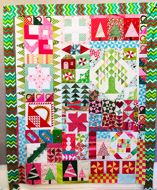
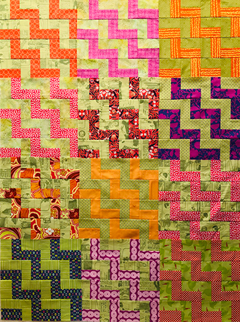
But just before sewing the borders to the quilt, I decide maybe I should audition it one more time.
YOWZA.
I’m not against bold, funky, even wild. But this is a lot even for me.
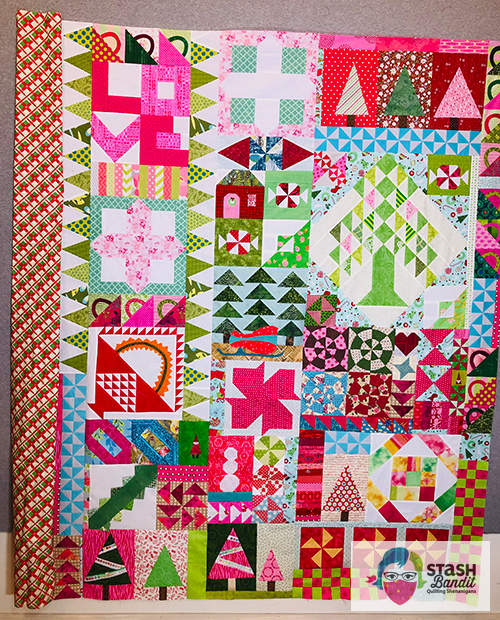
It was a good lesson. That one strip of chevrons looked okay to me.
Right? It’s not so bad. But I failed to recognize that such a bold print going all the way around the quilt would have a greatly heightened effect.
Back to square one.
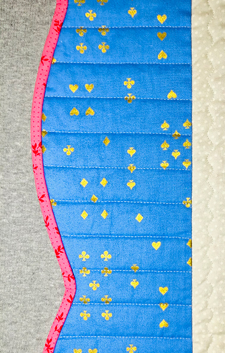
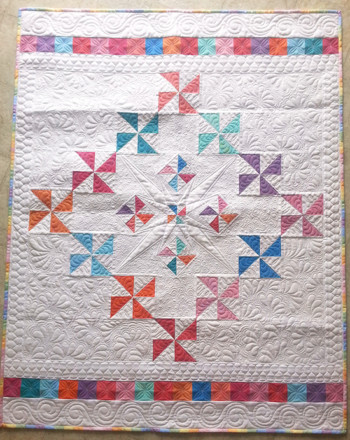
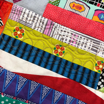
It seemed like the quilt wanted to be pink but also needed a shot of something strong to stop your eye. I created a narrow red flange and then I pieced a wide scrappy pink border. I’m calling it a day.
Just a note: I made the pink wide enough that I could scallop the quilt’s edges if I want. That’s not a decision you can make very early. We will see.
I will quilt this on my HQ Stitch 710 (great throat space) or my HQ Capri stationary longarm when it arrives in the next month or so. I will keep you posted!
So much to consider…great choice and great article. Good luck on your UFO’s!