By Diane Harris, HQ Stitch Brand Ambassador
There’s a lot of eye candy in the world of fabric these days. I love stopping by a quilt store and seeing new collections beautifully displayed together.
When I make a quilt, however, I’ve found that a single fabric collection is not what I prefer to use. I like more variety than one group of fabrics usually offers.
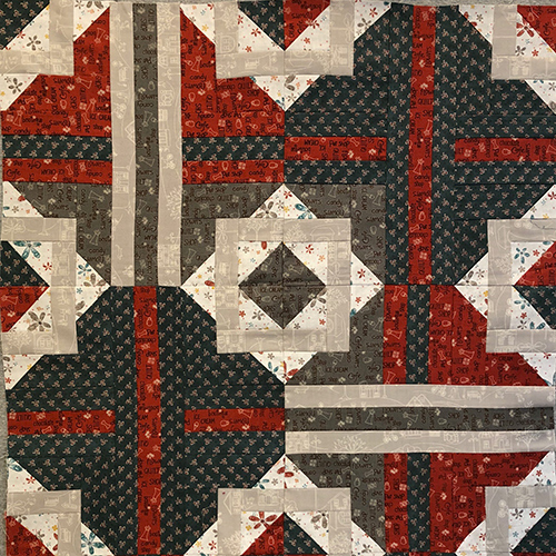
Here is part of a quilt sample I inherited. There is certainly nothing wrong with these fabrics. I think the colors are nice together. But I also see how improvements could be made if we branched out a little.

Let’s take a closer look at this block. There are a few things that could be improved.
- The dark gray and the red are the same print. I would do almost anything to avoid this. Sameness equals boredom. This is a wasted opportunity to create interest by using a different print.
- There is very little difference in the scale of these prints. All of the motifs are roughly the same size. Differences in scale create interest. Another wasted opportunity.
- The dark gray and the dark blue are so close in value (darkness or lightness) that they read as nearly indistinct from one another. A brighter blue would add a great deal of interest to the composition.
- Only the red fabric broadcasts color. Every other print reads as a neutral. Red plus a bunch of neutrals doesn’t spell interest.

I cut a variety of red and teal strips from my scrap bag and laid them on top of these blocks. You can see how some different shades of red add light and life. And the teals in different scales help a lot, too. It feels like there is more going on. There is more to see, and that keeps a viewer looking at a quilt for longer.
When I see a quilt made from just one line of fabric, I usually think the quilt looks very flat. It doesn’t seem to have enough vitality for me.

Here’s an exercise for next time you’re in a shop. You don’t need to actually buy the fabric. You can just play and learn.
- Find a collection of fabrics you like that are together in the store.
- Notice how many are darks, mediums and lights.
- Notice if there is any difference in the scale, i.e. the size of the prints. Mostly big? Mostly small? Mostly medium? An even mix?
- What is one of the main colors in the collection?
- From the collection, pull one bolt of the main color you identified.
- Carry the bolt around the store and look for other fabrics in this color that could add interest to the collection. Pull five or six bolts and observe how they might work together.
These are things you should learn to do whenever you shop for fabric. While a collection is a helpful starting point for planning a quilt, don’t ever think it’s the end of the road.
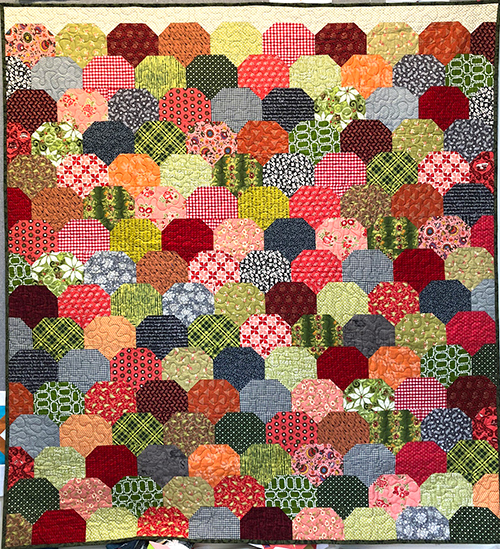
Instead, think of a fabric collection as a starting point to which you can add many more fabrics for interest. The quilt above is my scrappy version of Clambake, a pattern from Thimble Blossoms.

I started with about six fabrics from Fig Tree Quilts in Joanna’s signature palette of yellow-green and soft red. I added soft orange and gray.

From there I went to my stash and pulled fabrics in those colors. I went for lights, mediums and darks. I looked for large-scale prints and micro-prints.

I pulled reproductions, plaids and polka dots. I wanted motifs packed tightly together and spread far apart. I picked a couple of very graphic prints that didn’t seem to “go” at all. And I used every one.
A few more thoughts:
- Scrap quilts require a lot of deliberation. They’re harder to make successfully than quilts with just a few fabrics.
- They’re worth it.
- You get better with practice. Practice, practice, practice.
- Your stash should be organized enough so that you can see what you have and find what you need whenever you want to use it.
- A fabric collection is not the end of the road, but a starting point.
- Use your stash to add to a collection and make your quilts sing!
I always struggle with fabric selections. Great tips to look in a new way!
Thanks, Diane! You always have good tips!!
What size are your squares in the clam shell? Would be great for new quilters.
Hi Linda, The clamshell was made using the Clambake pattern from Thimble Blossoms. You can get a paper pattern or an instant pdf. Here’s a link: https://thimbleblossoms.com/products/clambake-pdf-pattern
Forgot to ask. Anyway to get a picture of the clam shell? Thanks for showing this.